
Blog
Design for Reading Distance
Use a simple test print to check lettering at the point where people need it.
Explore the details ↓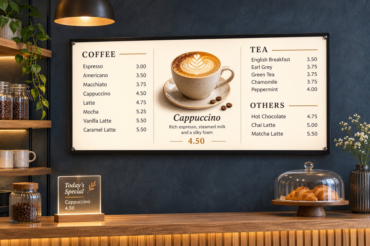
Project notes
Test the real decision point
Measure where someone first needs to read the sign, such as the start of a queue or a corridor junction. Place a print at the proposed height and view it from there.
Check contrast and reflections
Try the test in daylight and with interior lighting. Remove secondary copy if it competes with the direction or message that people need first.
Record one practical outcome
Keep a photo from the reading position and note which line was hardest to read. Update that line before approving the artwork.